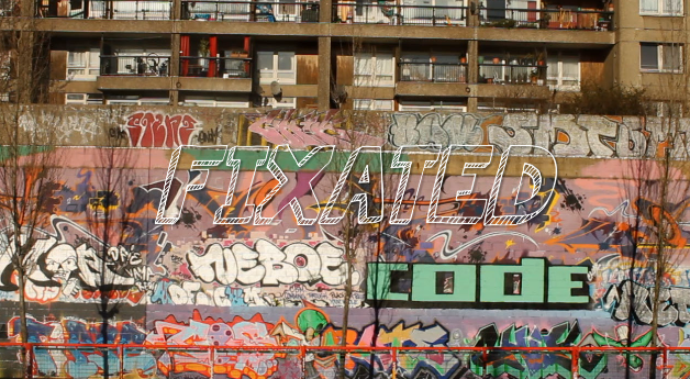
After watching my draft of my title-sequence over and over, I discovered the font I chosen didn't really suit well. Although, last time I chose font I got help my peers to help choose but this time round I went with my own opinion.
I went from "Permanent marker" font to "KGSummer Sun":
The reasoning from this change was it looks very similar to the font from the movie, "Juno". I like its imperfectness about it, it also matches the background containing graffiti. As well it fits my genre conventions of a "coming of age" it looks as if a teenager has written it.
 |
| The Juno Font |
The typography helps convey my genre, because my genre is a Coming Of Age story this contains a journey from one place to another; emphasising on the imperfect life (which happens with my settings) to when somebody is better off and living a happier life (which I show at the end).


No comments:
Post a Comment