Tuesday 24 March 2015

Evaluation: Part Eight

Looking back at your preliminary task, what do you feel you have learnt in the progression from it to the full product?

I believe what was successful about my preliminary task was my research and planning for my title sequence; knowing exactly what I want to produce along with having intertextuality references strengthened my confidence for my final piece. Going out of the norm of a thriller genre, I did challenge my comforts especially as i'm a new media student; luckily my research, again, did reinforce my confidence. Post-production was very successful for me as I am very familiar with computers, not so Final Cut Pro but I got the hang of it within two lessons, I was able to convey my ideas into the software and achieve exactly what I wanted. I am very proud of my cinematography which was prioritised by me in my planning.

What I believe wasn't so successful and what I can improve on next time round is organisation, especially whilst filming, I didn't try a variety of shots because I knew exactly what I wanted but there isn't nothing wrong with improving creativity. Although, I did see my organisation skills were slacking during production and I was able to change this; I wrote check-lists, agendas, got reassurance from my teachers beforehand and stayed behind school.

Evaluation: Part Seven

What have you learnt about technologies from the process of constructing this product?

I only wanted to use a tripod during scenic shots because they’re concrete, they’ll always stand tall whereas the unsteady shots were deliberate because it depicts the unsteady life she has. Google docs was used for my questionnaire because it enabled me to get a precise answer for my target audience research. A Canon DSLR was used to shoot my film because it specialises in filming compared to a regular SLR or digital camera. Dafont enabled me to use unique font compared to the defaults. Also, YouTube was used during post-production because it heightened my knowledge, by tutorials, on how to use Final Cut Pro. Then lastly, Final Cut Pro was used for my editing,

Monday 23 March 2015

Evaluation: Part Six

How did you attract / address your audience? 


This is the transcript: 

I think I did reach my target audience as, being a teenager, it includes everything I would want to see in a movie considering I currently am one; I desire stunning cinematography and a memorable soundtrack. Keeping in mind that my targeted audience are are teenage kids, predominantly female as they stereotypically favour dramas over males, I had to have an inspirational character in which they could idolise. Knowing there's a current movement of feminism within the younger generation, I wanted to show young girls in a good spirit, rather than a sex object the media portray women as. I achieved this with the help of costuming - by showing the journey of the protagonist from being poor to rich, referencing Hepburn's hat in Breakfast At Tiffany's to represent wealth, my character looks elegant rather than looking promiscious that some films do. Using films of similar target audience, I watched them and saw things I liked since i'm the same age, I liked the typography used in The Virgin Suicides and Juno as they look like a female teenager wrote it; this is a way I addressed my audience, even from my feedback my peers recognised the genre just from the typography used. 

Real media institutions target the teenage demographic as they're a mass audience, I have experienced this  first handedly, especially with the music industry. From my feedback sheet, every person wrote something about "soundtrack" and as teenagers are very involved in the music industry, I prioritised this immediately. With experience from seeing teenager's reactions and opinions to music on the social media, I can see their music taste through their "follow" tab. Although there are many genres of music, the most popular was "indie" and "alternative" music, therefore I chose a moderately new alternative band which use fast tempo beats. This was very successful as asking my peers afterwards, they seemed to remember the beat of the track.

With the conventions of a coming of age genre, one being realism, this is how I address my audience. Through the microfeatures it adds credability for the audience to seek advice / influence from: according to the Uses And Gratifications theory. Like AdULTHOOD, they address their audience through the setting - representing the not so wealthy people in suburban London through estates and flats.

Moreover, fashion is very important in teenage life. So integrating desirable costumes that the teenagers would like could potentially act as an exchange for the movie, as they may upload screenshots of the character's outfit. I've seen this with movies such as, "Clueless" and "LOL". Although in hindsight, this became less of a priority of mine and next time I would of reconsidered making it a priority because cinematography was most important to convey my macro features. Although you can easily address your audience through costuming.


According to my feedback, my cinematography was very successful. I took inspiration from Coppola's work in The Virgin Suicides as she portrays teenage emotion through the lens. I also believe the lighting in my title sequence was very successful as the semiotics of the bright lighting when she richer and the usage of dark lighting when she's miserable and poor. On that note, lighting could a address my audience because there's a spectrum of emotion within a teenager's life; so light is the happy and memorable moments whereas dark is the horrible moments.  This also attracts the audience as I do it in a not-so-patronising way, some films that target adults are written by people in their thirties or forties and they experienced adolescence in a different time period to the ones they're targeting; I have an advantage with this as i'm of the age of my target audience. Therefore, I can properly represent the current emotions of my target audience. A similar thing has been done with the film Kids (1995) by Larry Clark. The director was an 18 year old:


On the note of cinematography, I took inspiration from Kuleshov to help address teenage emotions. What he does is he shoots a particular scene then reverts to somebodies face, I do this to portray my protagonist's emotions:


For example, once she reaches where she wants to be, she looks far more content with life. Her performance alters from the beginning as at the start she looks very fed up:


Evaluation: Part Five

How does your media product represent particular social groups?

I represent many types of social groups based on: race, gender, age and regional identity. My protagonist is a sixteen year old black female living in the suburbs of London; there are many stereotypes just based upon black people but there's also stereotypes about teenagers and females. Being black, there's a stigma of being problematic, as well as teenagers - especially in the media. Females are seen as reliant on men and incapable of doing simple tasks. I represent all of these in my title sequence. I wanted to prove these "myths" false and change the perception for people; I do this via the hyperdermic needle theory. Staying closely related to the Uses And Gratifications, I know exactly what teenagers seek from movies as I previously done a questionnaire for this. A majority of teenagers, black/white male/female seek Identity which is where they look at characters as role models as they have similar values and can aspire to be them. As teenagers are quite young, they are still not as experienced in life, so being educated by movies they can see people in the film experiecing similar situations and can take advice from it and finally for soleful purpose of entertainmwent; similarly to how people saw the cinema in the 20's - a way of escaping reality.
 
Coming-of-age alone represents the teenage audience from one aspect of their life to another, the iconography of this genre is social realism and drama. Drama is prominent within a teenager's life. The usage of the microfeatures: cinematography, mise-en-scene, editing and sound help reach my macro features narrative, genre and audience.

With mise-en-scene costuming is important to help portray specific social groups; when my protagonist is poorer I use timberlands, earrings and short skirts stereotypically what teenagers wear as it's not very formal. I then change this when she's seen as richer, she wears a hat similar to Audrey Hepburn in Breakfast At Tiffany's - as Hepburn is seen as a beauty icon for young girls I integrated her famous hat in a satirical way - proving does a hat really make you seem wealthier? Referring to the study of semiotics, connotations of prominent in my title sequence so smoking connotes youth, trainers too.

Typography is very similar to Juno's and The Virgin Suicides, they use handwritten teenage girl like font which represents the social group of teenagers. It also adds an innocence to the tone, proving stereotypes are harsh, especially on young girls.

My soundtrack also represents teenagers because it's a modern indie band, teenagers recently are really into alternative music; also it's very upbeat and joyful emphasising youth.

Sunday 22 March 2015

Evaluation: Part Four

In what way does your media product use, develop or challenge forms and conventions of real media products?


A real media product, in some cases, use a title sequence - what a title sequence establishes is an insight into the narrative; sometimes introducing you to characters and settings. I used this convention with my title sequence in the similar way some film institutions do - by establishing narrative, setting, mood and having an "enigma" for the audience to uncover. 

I usec STINCS to represent my macrofeatures: Genre, Audience and Narrative when producing my title sequence. I also covered the usage of microfeatures: cinematography, sound, editing and mise-en-scene.

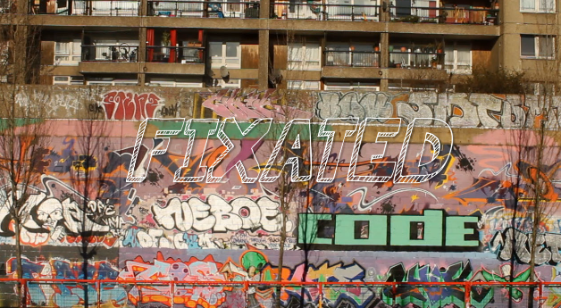
S meaning setting, this is a key point that helps convey a narrative, especially in my case. I show binary oppositions through my setting, poor with tall flats and vandalism juxtaposed to rich having elegantly designed architecture. Using a POV shot to establish this as I develop the covnention of realism within a coming of age genre. This also lets the targeted audience, teenagers, to easily relate to.

T is themes, I have a recurring theme of "dreaming" throughout my title sequence. I heavily relied on post-production to help aid me in showing this code by video filters and effects. Like The Virgin Suicides, a real media product, they use lighting to help represent youth - the binary oppositions of light and dark also relating to the study of semiotics with the connotations of lighting to emphasise the life of teenage years; good or bad.     

I is iconography, as my genre is a coming-of-age story I need to focus on the key iconography associated with this genre. "Coming" being a verb, it shows movement - or a journey in my case; so using ways of movement will be one iconography, trains, walking etc. Also, the connotations of the binary opposites: light / dark. To depict my protagonist being youthful, so the mise-en-scene includes urban costumes and movement. Finally, the rich areas I changed the costuming to represent the ideology of wealthy people so business wear, wealthier areas. I also use typography to aid me in portraying my genre, similarly to The Virgin Suicides and Juno they use imperfect, handwritten childlike font which represents the youth culture. Also as my audience is teenagers, they are very involved in the music scene, these are the years they develop their taste so I use a modern indie band to soundtrack my media product. I challlenge the conventions of transitioning between my shots, unlike films like Submarine they fade between each shot; this is because the movie is based in the 70s, mine is the present time and I don't use this.

N is narrative, I used many types of camera angles to help develop my narrative. For example, I used POV shot which indicates we're looking through the protagonist's eyes, seeing what she sees. This allows me to focus on the specific goal she's looking at. One convention of a coming of age genre is a resolution, showing long shots of her in the places she wants to be in with the skyline of London in the background. As my target audience are teenagers, I closely kept my title sequence with audience pleasures so: lifestyle, drama and relatble situations. Using fast pace editing in post-production to depict the dramas and dramatic lifestyle of teenagers. The continuity involves match-on-action and a fast pace because it represents her journey, one shot carries on with the other.

C is characters. Having my protagonist challenge stereotypes of young black girls, showing her actually doing well is a way to integrate equality into my title sequence. People see Monroe or Hepburn iconic, why isn't there a black female like this? Realism is one convention of a coming-of-age genre and I show this through realistic mise-en-scene and setting.

S is style, I use a very similar style to the virgin suicides as it mostly represents the teenage years. I use post-production filters to emphasise my themes and narratives, hazy / trance like similar to Sofia Coppola.

Saturday 21 March 2015

Evaluation: Part Three

What kind of media institution might produce your media product and why?


Thursday 19 March 2015

Evaluation: Part One

The brief I was working towards was finalising the title sequence for my coming-of-age movie “Fixated”; meaning she’s fixed on an idea/something, determined to achieve something good. I had to film different locations, scenes and angles along with focusing on the mise-en-scene, editing with Final Cut Pro and selecting the soundtrack. Fixated is about a financially unfortunate girl who lives in the suburbs of London, her environment is so poor that it drives her to dreaming of escaping. There’s a recurring theme of “dreaming” throughout. Her journey of improving her life begins; she travels to the city’s center surrounding herself with people she aspires to be; yet she’s out of place. Following her around London, you see get to see her dream as come true and the transition from the beginning. It finishes of on a good note where she finally gets to where she wants to be, a richer and happier state of mind.


The sub-genre is a “feel-good drama”, as you may feel good that you can see the juxtaposition from her being poor to rich and the improvement of how happy she is. The storyline and cinematography main goal is to be emotive, playing on the audience’s emotions.

Final Piece - "Fixated"


This is my final piece, containing the changes i've made over the months from typography changes, cast changes and even genre changes. All alterations have come down to this finale, i'm very proud of it considering I wasn't as confident with planning, videoing and editing all alone, but that made me want to achieve even more.

Intertextuality

What's intertextuality? The shaping of texts/films based upon another, using cross references.

I will be using intertextuality in my title sequence to help portray my narrative even further for the audience to understand. By using references to other films it can help the audience acknowledge similar patterns and work out the ending or what's going to happen next. As my genre is a coming of age the name gives it away, "Coming" a verb meaning something is expected. Ultimately, showing the journey of a girl wanting to change her life for the better - just like Audrey Hepburn:


Movies, especially before the new millennium, focus a lot on the journey from poor to rich. I believe it's down to the sense of theatre is the only place where dreams and inspirations took off and escaping reality for 2 hours was the best feeling in the world. Movies like Breakfast At Tiffany's (1961), It Could Happen To You (1994) and Trading Places (1983) 


With cross references, I will be using Breakfast At Tiffany's as one of many inspirations of mine, its iconic narrative, soundtrack and cast makes it one of the best movies ever produced. I've even gone down with using the protagonist's costuming to help symbolise, "wealth". In Breakfast At Tiffany's Audrey Hepburn is wearing a black hat when she becomes richer, once you see her on screen you can immediately tell she's blessed with fortune. With context from its time, you can see her elegance, high class haute couture fashion.


As well with smoking, Hepburn rejuvenates the look of smoking from my perspective in 2015 - normally linking it with a dirty habit; yet Hepburn makes it look classy and tasteful. I will be using the idea of smoking but in fact, I will be using in a different manor. I didn't choose this but it's the opinions of smoking in the present era that has already depicted it for me. In the 60's smoking was only for the luxurious, now it's very common hence why I will be using smoking to show how my protagonist still has that urban vein running through her.
Smoking In The Sixties

Furthermore, I want to alter the opinions of race and beauty in my movie. Movies like this contain such iconic beauty that nearly every girl looks up to, such as Hepburn and Marilyn Monroe. We already have Hepburn make smoking look stunning and we've also had Monroe make curves like ravishing but it's time to show black culture in a more exquisite lifestyle. Perhaps it will change the perceptions of beauty for others, it will also teach the audience not to limit beauty to a specific race.


Why That Cast?

Director Change

After finalising my title sequence, I had a realisation that my director, Noel Clarke, wasn't much suited for my specific genre and narrative. Focusing on his previous work, Adulthood, Kidulthood etc. you can see his work is very gritty, realistic and uses a lot of dark lighting. Now comparing to my final draft, I believe it wouldn't be a project he would do.

However, when looking at Adulthood I can see similar scenes to mine which proves why I initially chose Clarke to direct my film:
Train scenes 
My scenes with graffiti.

Scenes with graffiti in Adulthood
Whereas, Richard Ayoade has done similar movies with the exact feel I want to portray. Especially Submarine the grainy effect, faded colours and the definite stress upon their teenage emotions and settings. I adore his locations, lighting and post-production - exactly what I want to achieve: 

Monday 16 March 2015

Post-Production: Blank Space

On my time line I used a lot of black gaps in between most of my footage. Although they looked unintentional and unfinished, it was actually on purpose. I wanted to create an effect of my character blinking during a POV shot. I also liked the blank spaces because it gives more attention onto one clip. 

[video of blinking]

But after showing people, they said I should close the gaps. 

Friday 13 March 2015

Post-Production: Smoothcam and Motion Blur

I chose the effect, "Smoothcam" to run throughout my title-sequence, I really like the effect of it as it reinforces the theme of, "dreaming" it's smoothing and motion blurring of the footage helps achieve this. Especially on the shot below, it shows her in the last state before she transitions to more sophisticated and wealthier.  Also, I didn't use much of a tripod whilst filming because it also aided into the weird motion I wanted to achieve.  This is it with smoothcam:


This is the scene without smoothcam:


In the scene above, I also added the motion-blur effect; I deliberately chose this clip as it will set the tone of the entire title sequence. The effect I was aiming to achieve is a go-pro over the shoulder effect, giving it that following + dreamy atmosphere. 

My favourite scene is the ending, it's the final two scenes that contain the smoothcam and motion blur; it really adds stress upon the "dream" theme:

The Play Of Dark-To-Light Lighting

As my narrative is to show the journey of improvement throughout my title-sequence, I want to stress upon this with the lighting. The connotations of "Dark" shows emotions of sadness whereas "Light" shows emotions of happiness.

To use the dark lighting at the beginning to clearly prove her sadness. The graffiti shot was lightly saturated:

As you can see, it has very beautiful and clear lighting, but I didn't really want this.


Although I was graced with beautiful lighting on the dates of my shootings, I had to reincorporate the idea of my lighting. Relying on post-production to help me convey this idea. Therefore, I used an editing technique called, "Gamma Correction"

Playing with the effect, I got to play with the darkness:


As you can see with the before and after shots, I was able to alter the lighting:
Before: Light
After: Dark
After doing this, I can see it improves the grittiness of the location adding emphasis on her poor background.

Whereas the light side of the title sequence, I got very lucky with the sunny lighting so I didn't have to rely much on post-production. The light depicts the happiness my protagonist has in her current state of being up London:


Changing Of The Escalator Scene

In my title-sequence I play upon the idea of a "dream" involving a set-goal for my protagonist. In my sequence I initially had a shot of my actor going down on the escalator, I realised I didn't like the idea of this due to the connotations of going down, luckily in my reshoot I filmed her also going up the escalator. Going up towards her goal seems much more suitable than going down.

The original shot.


Nevertheless, I do like both over-the-shoulder cinematography in my sequence. This is to emphasise that we're following her. Although, I did change it to her going up, I prefer tis one because it's much more intimate than the last shot creating a synthetic relationship with the character; this is when the producer of the movie builds a relationship between the character and the audience, playing upon emotions.
 I prefer the closer, over-the-shoulder shot.

Alternating The Sound

Because my soundtrack is very long, almost seven minutes there was a specific section of this song that had an upbeat recurring beat that I wanted to integrate. Like previously, having a recurring theme of my typography, I want the similar effect with my soundtrack. I also had a thought that from the change from her being from poor-to-rich she's still the same person and still has the same values so thereforeby using the same font and soundtrack throughout this represents this. 

So to get the specific beat in the song, I copy and pasted the soundtrack twice into my timeline. One for the beginning and the second to crop to the specific part. I then discovered a problem with using two different sections of the same song - the crossover between the two. Luckily with my own knowledge, I knew I could use a fading crossover to help remove the major transition from the slow intro into the upbeat climax of the song. Done here, I used the Cross Fade (+3dB) because it gets louder so it adds three dB.


Also I added a cross fade at the beginning of my title sequence so there isn't an impactful start, it wouldn't fit my genre. Therefore by using a cross fade to let the music slowly come into play. 
On the note of the sound, as you can see in the photo above the sound doesn't start from the exact start. In fact, it starts after one clip of footage, I done this deliberately because I like the feel of the footsteps in the audio of the clip - it adds a dramatic start. It also adds emphasis on focusing on the character, you aren't drawn away by a soundtrack. 

I removed the audio from all off my clips, except the beginning: 
You can also see the fade effect appear at the end of the soundtrack. The reasoning behind this is because,just like the start, I don't want an abrupt ending to my title-sequence, I want it to fade into the start of the actual movie. Unlike last time, I increased the length of the cross fade because it adds to the idea of the "dream" theme I want to produce. Slowly ending to indicate her happy ending:


Post-Production: Money scene

I wanted to use direct symbolism to indicate certain aspects of my protagonist; as she starts off in a poor and run-down area, other than showing her location I went one step further and showing spare change to emphasise her wealth.

With the feedback from my peers and especially my teacher, they all mentioned that the money scene looked a bit out of place. Although I was able to capture the darks-to-lights that I planned for my film, the lighting of this part was very out of place - it had an orange tint to it.

 As you can see, the orange tint is very prominent. Almost matching the coins; because it really played on my mind, I went and reshot this scene in its entirety. Keeping in mind my actor doesn't go to the same school as me and as well living on the other side of London, I had to improvise. I looked around school to find a similar skin tone as my actor in order to redo this.


After the reshoot, this was my end result:

I then incorporated this into my sequence, finally showing the people around me they didn't really like the look of her hand. It looked out of place, as much as the last. Therefore, having to rethink again I discovered the power of 3-way colour correcting.


With the amazing use of Final Cut Pro, I was able to alter the colouring of this awful shot. Focusing on the blacks and the mid-tones, I played around with it until I got a satisfactory colour. In the end, I could see the difference and was much nicer than the last.


The money scene is specifically important as my genre is, "coming-of-age" it shows a journey from one place to the other. Showing she has not a lot of money and then comparing her to when she's looking more wealthy and in a different environment.

Post-Production: Typography Change


After watching my draft of my title-sequence over and over, I discovered the font I chosen didn't really suit well. Although, last time I chose font I got help my peers to help choose but this time round I went with my own opinion. 

I went from "Permanent marker" font to "KGSummer Sun":

The reasoning from this change was it looks very similar to the font from the movie, "Juno". I like its imperfectness about it, it also matches the background containing graffiti. As well it fits my genre conventions of a "coming of age" it looks as if a teenager has written it.

The Juno Font

 Previously, I wanted to use two different fonts for the titling of my film to the credits. However, this has changed. I have now used a recurring theme throughout as I believe it just indicates the genre of the movie.


The typography helps convey my genre, because my genre is a Coming Of Age story this contains a journey from one place to another; emphasising on the imperfect life (which happens with my settings) to when somebody is better off and living a happier life (which I show at the end). 


Thursday 12 March 2015

Post-Production: Soundtrack Change

After discovering that "HNSCC" by The 1975 doesn't fit my genre, I went on a quest to find a much more fitting song that'll best suit my genre, narrative as well as exerting that "feel-good" atmosphere.  I have chosen a song called "Hearts" as it has a dreamy and trance feel to it, creating that much desired atmosphere that I am seeking from my title sequence. It suits it effortlessly and definitely creates that tone, i'm very pleased with discovering this song.

Reshooting: Final

After showing my peers and teachers my not-so-finished title sequence, I am glad with the much appreciated feedback, as its boosted me with the ideas needed that will help with the shooting.

In order to signify the journey of my protagonist from rags-to-riches, I location scouted to help convey this. Sticking out most to me was the shard situated in the heart of London. It's elegant design, immense height and overall stunning look I best believe it will aid me in proving Ruby's journey. I took about 5 takes from underneath the building, showing Ruby walking towards this, making it her goal. As well as shooting from far away with The Shard in the back to create that goal. Using steadicam and POV shots, it helped me in indicating my narrative, by focusing on a specific goal using a POV it allowed the idea of a set goal to come alive. The steadicam made the feel of us following her much more realistic.

Furthermore, I relied on luck to find me the best locations for my shoots (but closely sticking to the city's centre to keep that sophisticated yet business feel). Shooting my actor walking along the river's side with the beautiful skyline in the back reinforces the context and setting. Shooting my actor outside colourful buildings in order to create that vivid dream like state because I want dark colours at the beginning which slowly turns into the dramatic and the bursting of colours at the end.


I also shot public transport as that represents, "movement" or "journey" to aid my narrative of the journey of the protagonist. I purposely didn't choose to use the public transport at the end because I wanted the audience to know she has in fact reached her destination, which will let the movie go on.


Costume Change: Urban to Sophisticated

In my previous post of my mise-en-scene costuming, I want to keep the use of the "urban" feel. Using trainers and cigarettes to signify the idea of how "street" Ruby. I then wanted this to be juxtaposed on the flipside of my title sequence - the side where the protagonist is seen as much more sophisticated and wealthier.

Using very formal and business colours whilst in the city centre emphasised the idea of how she's meant to fit in, showing professionalism. The use of the glasses, floppy hat and the blacks and greys help convey this idea of business:


Tuesday 3 March 2015

Planning For Final Shoot

After the week of intense filming, I wasn't able to gather all the required shots that I needed. For my reshoot, I want to really focus on the fact of her transition from poor to rich therefore I will be staying in areas with tall skyscrapers and business people.

I want to my protagonist to focus on one goal and I need this to be evident for the audience to see. So I need to locate a building that's you can see she's focusing on. I want to use The Shard in the heart of London as it's a unique and elegant building and also doesn't look like any other architecture surrounding it.

  • In another way of proving the narrative, I want my character to point at a building on a map or actually point to the building. 
  • Also, I want to do more over-the-shoulder shots where I am following her.
  • I want my character to stand in front of the London skyline, proving how little she is compared to the buildings. I need her to look vulnerable but determined to get there.  
  • Finally, showing her walking right underneath The Shard  where I pan up. 

The portrayal of suburbs to the city center is very popular in movies, especially in one of the most iconic movies of its time Breakfast At Tiffany's, grossing over $20,000,000 since its release in 1960's it boasts its most influential character - Audrey Hepburn. Representing her journey through the stroy
line is exactly what I want to exemplify.

Audrey Hepburn, Breakfast At Tiffany's, 1960s.

Wednesday 18 February 2015

On set: Meeting minutes

On Monday, I planned all things I needed to be done for the next day. By doing this, it allowed me more time to focus on filming efficiently.

 This is where I was shooting, just off Portobello Road. It suited the ideas in my head perfectly, I needed an estate / run-down and rough area to emphasise the poor conditions my protagonist lives in.


This is who's playing, "Ruby". The outfit indicates her urban attitude and look, wearing boots and a parka.


Today, Monday, 16th February, I have gone to North Kensington Library in order to write up a plan and as it's near my desired location, I was able to look around and take pictures. (see above).

So Today, (Tuesday 17th, February). I started off the day with packing my bag with the equipment. Ensuring everything is working, charged and ready-to-go. Leaving my house at 12pm, I got to my setting around 1pm. Staying there for an hour and a half, I was able to shoot 4 shots that include a POV shot, low angle and a panning left close-up. Compared to my first draft, I see a major improvement. Although, last time I didn't bring a tripod and unfortunately, it broke whilst shooting therefore I had to improvise immediately and use railings and concrete sides to support a steady shot. Nevertheless, the quality is adequate enough for my final piece.

Further planning for "Fixated"

I started filming on January 30th, this is where I produced mock-up shots. I wanted it to be very amateur/handheld so I didn't use a tripod; however, after watching back the shots I realised this wasn't for me. I wanted it to be shot properly and steady. On my re-shoot, which I am planning to do during the half-term. I've thought of a production Schedule: 
  • Monday: - Plan exactly the settings I would like to shoot, by googling how to get there, researching facts about it to see whether it's most suited for my movie. Look at many places that have a run-down environment. 

Ensuring I remember all items.
  • Tuesday: Morning - Prepare for the shoot, ensure both camera batteries are fully charged. Tripod and camera is packed in a bag, safely. Storyboard and production brief is also packed to stay related to it.  Midday - Go out and shoot, until around 4 o'clock I will see whether the shots that I need to have a day-time setting is perfected, if not I will still have time to redo it. Taking many shots, in not just one setting to maximise the variety of work i'm able to work with. 
  • Wednesday: Morning - see what shots will need redoing, and go up London to reshoot. Also to try different camera angles. 
  • Thursday: A week ahead, I have asked if my actor will be free on these dates, unfortunately she isn't on Thursday. So in the meantime, I will shoot the shots that doesn't need an actor. Such as scenic shots of the city's skyline as well as trains. 
  • Friday: This will be my last shooting date of the half term as my actor is busy for the weekend. Finally, after looking after the weeks shoot I will see what looks the best and what doesn't. Sorting them into files as I do not want to delete the not-so good shots. 
I will want all my filming to be completed by Saturday as I will want to have as much time with post-production.

Sunday 15 February 2015

Genre Change

After continuously researching movies similar to the films I seek influence from: Juno and Submarine, I realised a "Feel-good" drama wasn't for me. From developing plans I discovered I want to alternate from a "Feel-good" to a "Coming Of Age" story, however keeping the a "feel-good" atmosphere.

The reasoning for my change was down to my narrative, although in fact both genres correlate with with my narrative but I believe a "Coming Of Age" suited it more although, I will still want the "feel-good" atmosphere being produced in the title sequence; down to the fact that you aren't going to "feel-good" throughout the movie because I want to have a sympathetic and sad tone at the beginning of the movie. Moreover, it'll be less of a challenge trying to convey a "feel-good" atmosphere just from a title sequence, as a "coming of age" story will be far more easier as her journey from rags-to-riches symbolise this.

Soundtrack ideas

I gathered what soundtrack, because in my feedback I got told to work on it. I wanted for my title sequence, however, I have been told I am not allowed to use copyrighted music.

Consequently, I am currently trying to find a perfect soundtrack that will be most suitable for my title sequence. Although, in my animatic, I will use the song I desired so in the mean time I can spend longer with searching:

I chose this song due to the atmospheric and textual tone throughout the song. Although it's only 2 minutes long I believe it's almost perfect to my title sequence. In an ideal world where copyright laws weren't an issue, this would be my go-to song. I think a song similar to this will suffice because I don't want no vocals removing the attention from the visuals. However, I do want the audio to compliment the visual aesthetic that I will produce. Having an instrumental and atmospheric audio leaves the whole concept questionable and open into interpretation. Having no dialogue and lyrics, I will want the audience to interpret my title sequence concept and fit it into their own experiences and personal life. So in the mean time, I will be spending a lot of time scouring the internet for the most suitable song for my title sequence.

Friday 13 February 2015

Credits: First Look


Order of credits:
{[{
1 - [Studio logos]{

2- - Film 4 Presents
A Pathe Film Production
 3 –  Fixated

4 - Red Madrell
Geraldine James
Freya Mavor

5. Casting:
 Tommy Mahoney
Jade Northen

Production Designer:
Tommy Mahoney

Costume / Make-up:
Gemma Hancox

Special Effects:
Laura Woodburn 

Music / Sound Editor:

Chris Martin 

Photography:

Sofia Coppola

Producer / Writer: 

Richard Ayoade

Director: 
Richard Ayodade


Search This Blog