Title sequence -
The title sequence gives a short two to three minute insight into the movies: funding companies, actor credits and also a hint to the storyline; mostly creating an engaging enigma for the audience to be hooked instantly.For my title sequence, I want to mostly centre on her dream as this main focus of this movie. I will start with Ruby around her home environment, going towards her flat indicating to the audience this is her living conditions. The camera will change to a camera shot of Ruby sitting in a coffee shop, fantasising about being successful in central London where business is most vivid. Once in her "dream", I will make the scenes more colorful intense proving this is a light in her life, showing her walking out of a train station into the architecture heavy areas. Although, this shows she's a "fish out of water" not belonging in these places. However, I will show how she still carries the "chav" stereotype by smoking. Then, how she really isn't accepted in these places by bumping into people/arguing then finally being snapped of the dream in the coffee shop and returning back into her less fortunate lifestyle.
Post-production ideas -
- For post-production, I really want to exemplify how dark and isolated she feels in her current living state; using dark contrasting effects and possible vignetting on the camera shots.
- In the transition from reality to fantasy, I want to show fading CGI or some kind of journey indicating how how big the spectrum is from rich to poor.
- When in the dream, using a high contrasting and blurring will signify the fantasy life-style.
- Editing pace will be quite slow in the beginning to symbolise how she's stuck in this environment then contrasting to fast-paced jump-cuts to focus on how her dreaming comes to an abrupt end.
- I will try to focus on the colour of Ruby compared to the people surrounding her to add stress to how different she is to everybody.
Typography ideas -
I will use two different fonts between the title to actor credits because I want the name to be more dramatic than the credits.
For the title of the movie, "Fixated" I will use the font "Permanent marker" from http://www.fontsquirrel.com/fonts/permanent-marker
 |
| Permanent marker with my title. |
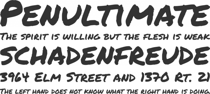 |
| "Permanent marker" |
I will use a different font when broadcasting the actor's names and production companies that helped with the movie. I am still yet indecisive with what font that I believe will best suit my genre/narrative and target audience, so here's the few i've gathered:
 |
| "Is that clear?" This font is quirky, less serious and will be suitable for a younger audience. |
 |
| "Mala's Handwriting" Is also quirky and less formal font, childlike almost which could indicate Ruby's age/character. |
 |
| "Fun sized" I'm not as sure with this one due to the font i've chosen for my title because these are very two dramatic fonts. |
 |
| "Handwriting" |
 |
| "Whimsical Wilma" this is self-explanatory, it's quirky and whimsical.
I'm slightly leaning towards the movie I seek influence from, Juno, as this movie uses imperfect and childlike handwriting; proving this movie isn't so serious, light-hearted and almost comedic.
 Help me decide: As well as an online poll, I created a voting sheet for my peers to fill out; voting for which typography they think is most suitable for my film.  |
No comments:
Post a Comment