Friday, 13 March 2015

Alternating The Sound

Because my soundtrack is very long, almost seven minutes there was a specific section of this song that had an upbeat recurring beat that I wanted to integrate. Like previously, having a recurring theme of my typography, I want the similar effect with my soundtrack. I also had a thought that from the change from her being from poor-to-rich she's still the same person and still has the same values so thereforeby using the same font and soundtrack throughout this represents this. 

So to get the specific beat in the song, I copy and pasted the soundtrack twice into my timeline. One for the beginning and the second to crop to the specific part. I then discovered a problem with using two different sections of the same song - the crossover between the two. Luckily with my own knowledge, I knew I could use a fading crossover to help remove the major transition from the slow intro into the upbeat climax of the song. Done here, I used the Cross Fade (+3dB) because it gets louder so it adds three dB.


Also I added a cross fade at the beginning of my title sequence so there isn't an impactful start, it wouldn't fit my genre. Therefore by using a cross fade to let the music slowly come into play. 
On the note of the sound, as you can see in the photo above the sound doesn't start from the exact start. In fact, it starts after one clip of footage, I done this deliberately because I like the feel of the footsteps in the audio of the clip - it adds a dramatic start. It also adds emphasis on focusing on the character, you aren't drawn away by a soundtrack. 

I removed the audio from all off my clips, except the beginning: 
You can also see the fade effect appear at the end of the soundtrack. The reasoning behind this is because,just like the start, I don't want an abrupt ending to my title-sequence, I want it to fade into the start of the actual movie. Unlike last time, I increased the length of the cross fade because it adds to the idea of the "dream" theme I want to produce. Slowly ending to indicate her happy ending:


Post-Production: Money scene

I wanted to use direct symbolism to indicate certain aspects of my protagonist; as she starts off in a poor and run-down area, other than showing her location I went one step further and showing spare change to emphasise her wealth.

With the feedback from my peers and especially my teacher, they all mentioned that the money scene looked a bit out of place. Although I was able to capture the darks-to-lights that I planned for my film, the lighting of this part was very out of place - it had an orange tint to it.

 As you can see, the orange tint is very prominent. Almost matching the coins; because it really played on my mind, I went and reshot this scene in its entirety. Keeping in mind my actor doesn't go to the same school as me and as well living on the other side of London, I had to improvise. I looked around school to find a similar skin tone as my actor in order to redo this.


After the reshoot, this was my end result:

I then incorporated this into my sequence, finally showing the people around me they didn't really like the look of her hand. It looked out of place, as much as the last. Therefore, having to rethink again I discovered the power of 3-way colour correcting.


With the amazing use of Final Cut Pro, I was able to alter the colouring of this awful shot. Focusing on the blacks and the mid-tones, I played around with it until I got a satisfactory colour. In the end, I could see the difference and was much nicer than the last.


The money scene is specifically important as my genre is, "coming-of-age" it shows a journey from one place to the other. Showing she has not a lot of money and then comparing her to when she's looking more wealthy and in a different environment.

Post-Production: Typography Change


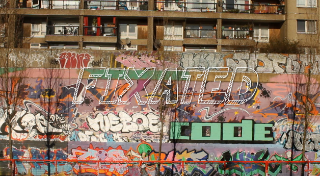
After watching my draft of my title-sequence over and over, I discovered the font I chosen didn't really suit well. Although, last time I chose font I got help my peers to help choose but this time round I went with my own opinion. 

I went from "Permanent marker" font to "KGSummer Sun":

The reasoning from this change was it looks very similar to the font from the movie, "Juno". I like its imperfectness about it, it also matches the background containing graffiti. As well it fits my genre conventions of a "coming of age" it looks as if a teenager has written it.

The Juno Font

 Previously, I wanted to use two different fonts for the titling of my film to the credits. However, this has changed. I have now used a recurring theme throughout as I believe it just indicates the genre of the movie.


The typography helps convey my genre, because my genre is a Coming Of Age story this contains a journey from one place to another; emphasising on the imperfect life (which happens with my settings) to when somebody is better off and living a happier life (which I show at the end). 


Thursday, 12 March 2015

Post-Production: Soundtrack Change

After discovering that "HNSCC" by The 1975 doesn't fit my genre, I went on a quest to find a much more fitting song that'll best suit my genre, narrative as well as exerting that "feel-good" atmosphere.  I have chosen a song called "Hearts" as it has a dreamy and trance feel to it, creating that much desired atmosphere that I am seeking from my title sequence. It suits it effortlessly and definitely creates that tone, i'm very pleased with discovering this song.

Reshooting: Final

After showing my peers and teachers my not-so-finished title sequence, I am glad with the much appreciated feedback, as its boosted me with the ideas needed that will help with the shooting.

In order to signify the journey of my protagonist from rags-to-riches, I location scouted to help convey this. Sticking out most to me was the shard situated in the heart of London. It's elegant design, immense height and overall stunning look I best believe it will aid me in proving Ruby's journey. I took about 5 takes from underneath the building, showing Ruby walking towards this, making it her goal. As well as shooting from far away with The Shard in the back to create that goal. Using steadicam and POV shots, it helped me in indicating my narrative, by focusing on a specific goal using a POV it allowed the idea of a set goal to come alive. The steadicam made the feel of us following her much more realistic.

Furthermore, I relied on luck to find me the best locations for my shoots (but closely sticking to the city's centre to keep that sophisticated yet business feel). Shooting my actor walking along the river's side with the beautiful skyline in the back reinforces the context and setting. Shooting my actor outside colourful buildings in order to create that vivid dream like state because I want dark colours at the beginning which slowly turns into the dramatic and the bursting of colours at the end.


I also shot public transport as that represents, "movement" or "journey" to aid my narrative of the journey of the protagonist. I purposely didn't choose to use the public transport at the end because I wanted the audience to know she has in fact reached her destination, which will let the movie go on.


Costume Change: Urban to Sophisticated

In my previous post of my mise-en-scene costuming, I want to keep the use of the "urban" feel. Using trainers and cigarettes to signify the idea of how "street" Ruby. I then wanted this to be juxtaposed on the flipside of my title sequence - the side where the protagonist is seen as much more sophisticated and wealthier.

Using very formal and business colours whilst in the city centre emphasised the idea of how she's meant to fit in, showing professionalism. The use of the glasses, floppy hat and the blacks and greys help convey this idea of business:


Tuesday, 3 March 2015

Planning For Final Shoot

After the week of intense filming, I wasn't able to gather all the required shots that I needed. For my reshoot, I want to really focus on the fact of her transition from poor to rich therefore I will be staying in areas with tall skyscrapers and business people.

I want to my protagonist to focus on one goal and I need this to be evident for the audience to see. So I need to locate a building that's you can see she's focusing on. I want to use The Shard in the heart of London as it's a unique and elegant building and also doesn't look like any other architecture surrounding it.

  • In another way of proving the narrative, I want my character to point at a building on a map or actually point to the building. 
  • Also, I want to do more over-the-shoulder shots where I am following her.
  • I want my character to stand in front of the London skyline, proving how little she is compared to the buildings. I need her to look vulnerable but determined to get there.  
  • Finally, showing her walking right underneath The Shard  where I pan up. 

The portrayal of suburbs to the city center is very popular in movies, especially in one of the most iconic movies of its time Breakfast At Tiffany's, grossing over $20,000,000 since its release in 1960's it boasts its most influential character - Audrey Hepburn. Representing her journey through the stroy
line is exactly what I want to exemplify.

Audrey Hepburn, Breakfast At Tiffany's, 1960s.

Search This Blog